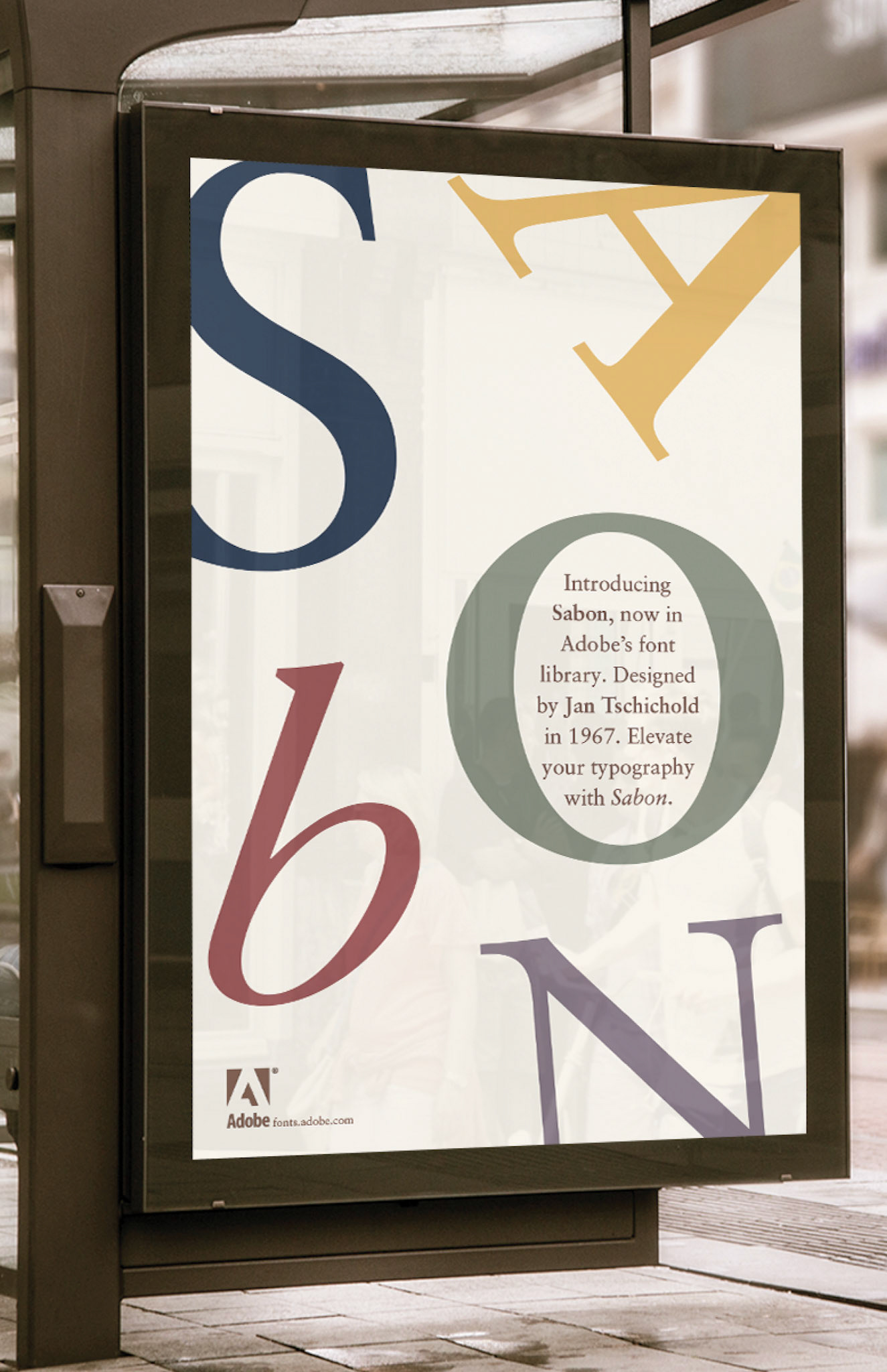
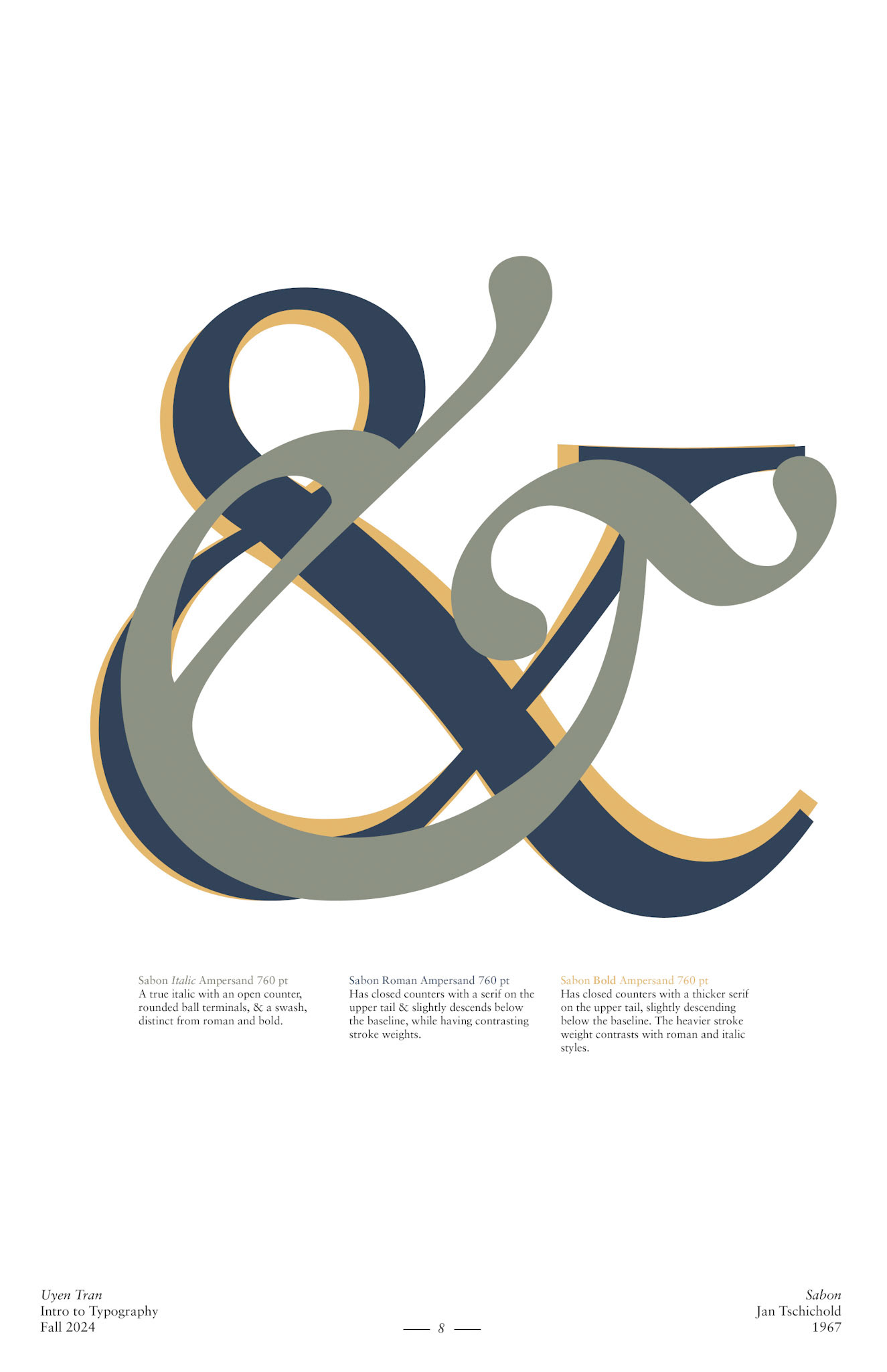
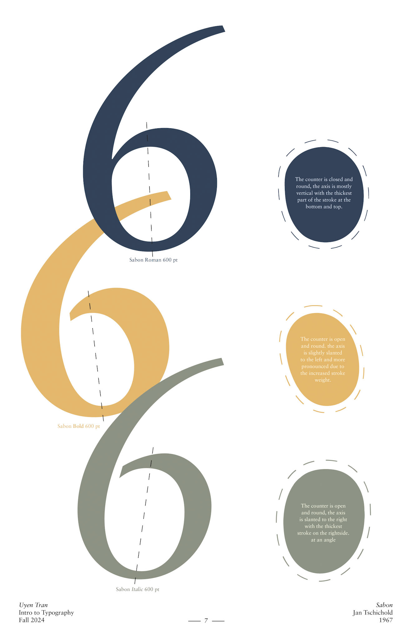
For my exploration of the typeface Sabon, designed by Jan Tschichold in 1964, I researched its history and purpose, discovering its elegant and timeless quality. I created specimen sheets showcasing its different styles and experimented with typesetting through variations in size, leading, and tracking. The typeface’s refined character led me to describe it as balanced, understated, and subtle. I also compared the nuanced differences within Sabon’s type family to better understand its versatility and sophistication.